


Imagine walking into a meeting where the sales team reports a 10% increase in revenue, but the finance team reports a 2% decline. The room goes quiet. Fingers get pointed. Instead of discussing strategy, the entire hour is spent arguing about whose spreadsheet is right.
This scenario plays out in boardrooms every day. In fact, a 2022 Gartner report found that 60% of organizations experience decision delays due to conflicting data from multiple sources. When an organization lacks a single source of truth, trust erodes. Decisions stall. Profits suffer.
Good data should drive standards and profits, not confusion. According to Forrester, companies that prioritize data quality and unified reporting are 58% more likely to exceed their revenue goals. If your organization struggles with conflicting reports, ghost dashboards, or data that doesn’t spark action, it’s time for a serious audit of your reporting infrastructure.
The High Cost of Multiple “Truths”
A “source of truth” is the definitive data set that everyone in the company relies on. It’s the gold standard. Unfortunately, many businesses operate with multiple, conflicting sources of truth.
This usually happens organically. The marketing department buys a new analytics tool. Operations builds a custom SQL database. Finance sticks to their legacy ERP system. Over time, you end up with a fractured landscape where “revenue” means something different to everyone.
The costs of this fragmentation are real:
- Wasted Time: Teams spend hours reconciling numbers instead of analyzing them. IDC estimates that knowledge workers spend up to 2.5 hours per day—roughly 30% of their workday—searching for information or duplicating data-related tasks.
- Analysis Paralysis: Leaders hesitate to make decisions because they don’t trust the numbers. In a recent Harvard Business Review study, 72% of business leaders admitted to delaying key decisions due to doubts over data validity.
- Missed Opportunities: While you argue about the data, your competitors are acting on theirs. A case study from a Fortune 500 retailer revealed that streamlining to a single source of truth reduced reporting cycle times by 60% and enabled leadership to capitalize on market trends faster than their rivals.
You cannot build a data-driven culture if no one agrees on the data.
The Zombie Dashboard Problem
Another common issue is the accumulation of “Zombie Dashboards”—reporting modules that are technically alive but effectively dead.
Research by Deloitte found that 43% of companies maintain legacy dashboards and reporting systems long after newer, more reliable tools have been rolled out—creating confusion and resistance. One global manufacturing client reduced employee onboarding time and boosted adoption of a new BI tool by 40% within six months simply by decommissioning dozens of outdated dashboards.
When you upgrade to a modern Business Intelligence (BI) tool or roll out a new reporting module, did you retire the old one? Or did you leave it running “just in case”?
Leaving old systems active creates a safety net that strangles adoption. If users can still access their comfortable, familiar (and likely inaccurate) legacy reports, they will. They won’t adopt the new, vetted system.
You must be ruthless about retiring old dashboards.
This requires a clear transition plan. Communicate the cut-off date, provide training on the new tools, and then turn the old lights off. It forces the organization to align on the new, vetted standard.
Is Your Data Properly Vetted?
Shiny dashboards are dangerous if the underlying data is garbage. A beautiful visualization of incorrect data is just a faster way to make a bad mistake.
Before you build the dashboard, you must vet the data pipeline. This involves:
- Data Cleansing: Removing duplicates and correcting errors. Experian’s 2023 Data Quality Benchmark Report found that U.S. businesses attribute an average of 25% loss in revenue to inaccurate or incomplete data.
- Standardization: Ensuring “Customer ID” follows the same format across all systems. A financial services firm, after implementing standardized data processes, cut reporting errors by 80%—saving millions in compliance costs.
- Governance: Establishing who owns the data and who is allowed to change it. Clear governance accelerated decision-making by 33% in a case reported by McKinsey.
When a leader looks at a number, they shouldn’t have to ask, “Is this right?” The vetting process should happen long before the data hits the screen. Confidence in data integrity is the bedrock of decisive leadership.
From Analysis to Action: The Power of the CTA
Data without direction is just noise. The purpose of a dashboard isn’t just to show information; it is to provoke action.
Does your current reporting have strong Calls to Action (CTAs)?
A passive dashboard shows a line going down. An active dashboard flags the decline, identifies the root cause (e.g., “Region North Sales Down 15% due to inventory shortage”), and suggests a next step.
Your leaders are busy. They don’t have time to be data detectives. They need dashboards that serve as decision-support tools. Best-in-class dashboards answer the question: “So what?”
A McKinsey survey concluded that organizations that deployed dashboards with clear CTAs improved decision response time by 22% compared to those using only static reports.
If a metric is off-track, the dashboard should scream for intervention. If a metric is crushing targets, it should highlight the win so the strategy can be replicated elsewhere.
Using Red, Yellow, and Green to Change Behavior
The simplest tools are often the most effective. The traffic light system—Red, Yellow, Green—is a universal language for performance management. But are you using it correctly?
It’s not just about coloring a cell in Excel. It’s about psychological impact and behavioral change.
A tech company that introduced a Red-Yellow-Green dashboard across all business units saw a 36% increase in team accountability and a 28% faster escalation of critical issues, according to their internal review.
Red: Immediate Intervention Required
Red shouldn’t just mean “bad.” It should mean “stop and fix.” It signals a critical failure that threatens the standard. It demands an immediate response plan.
Yellow: Caution and Course Correction
Yellow is the most critical zone for proactive management. It means you are drifting. It allows a leader to intervene before the situation becomes a crisis. A dashboard that effectively highlights Yellow indicators saves companies millions by preventing failures. One logistics firm reported that early intervention triggered by Yellow indicators reduced supply chain disruptions by 15% year-over-year.
Green: Championing Positive Behavior
Green is often ignored, which is a mistake. Green isn’t just “good”; it’s an opportunity to champion positive behavior. When a department hits Green, acknowledge it. Reward it. Study it.
By using comparative data with these simple indicators, you create a competitive, transparent environment. When a manager sees their peer in the Green and themselves in the Yellow, human nature takes over. They work harder to change the color. That is data changing behavior.
Consistency from the C-Suite Down
Data consistency isn’t just a best practice—it’s the backbone of a successful organization. From the executive team to front-line managers, everyone must be aligned with a single source of truth to achieve financial, operational, brand, and sales goals. When each department works off the same set of numbers and insights, leadership can make informed decisions, teams can execute with confidence, and the business can move forward as a unified whole.
Strong calls to action should be present at every level, ensuring that data isn’t just reviewed but acted upon. This alignment transforms a dashboard from a passive reporting tool into an engine for continuous improvement.
Crucially, you cannot afford to wait until the third quarter to realize performance gaps or opportunities. Success demands ongoing measurement and adaptive action. Regular access to up-to-date, consistent data enables leaders and teams to course-correct in real time, meeting goals proactively rather than analyzing missed targets after the fact.
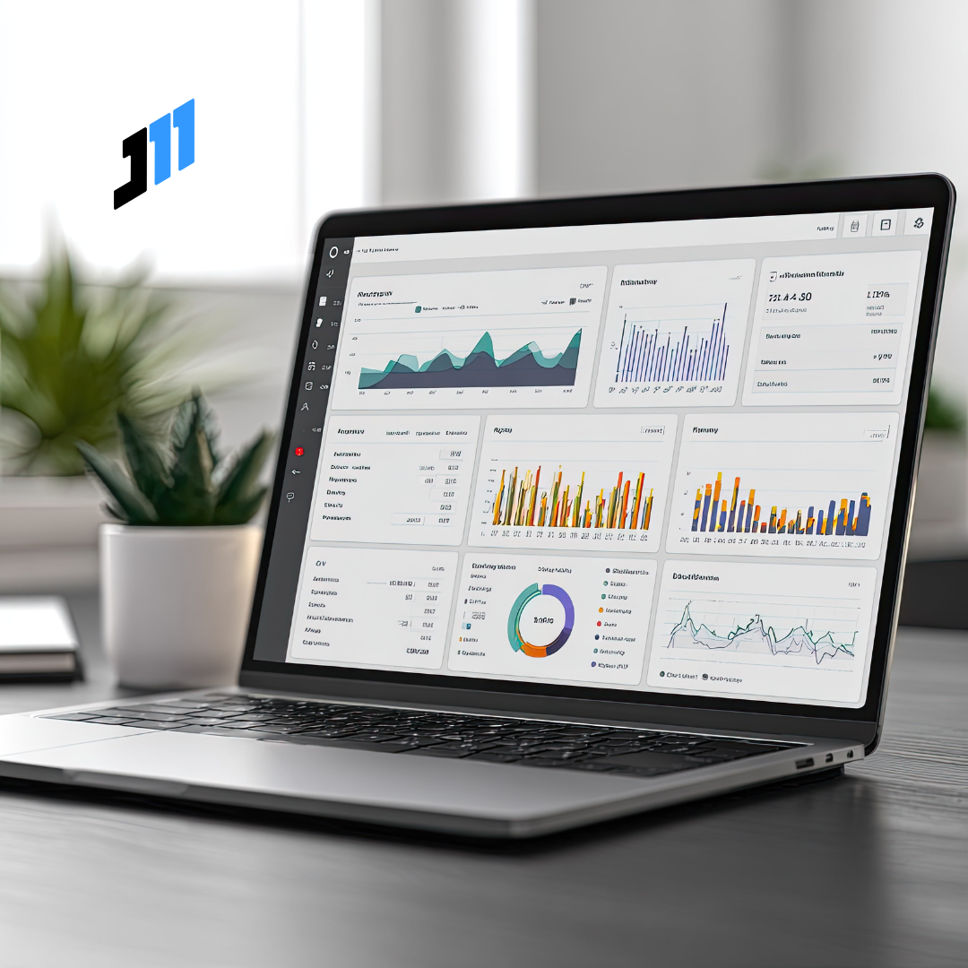
Build Best-in-Class Dashboards with J-11 Consulting
You have the raw data. You have the ambition. But do you have the clarity?
Transforming a messy data landscape into a streamlined engine for profit requires expertise. It requires knowing what to measure, how to display it, and how to ensure it tells the truth.
At J-11 Consulting, we help organizations develop best-in-class dashboards that strip away the noise and focus on what matters. We don’t just build reports; we build decision-making infrastructure.
Don’t let bad data drive your business into the ground. Let’s build a standard that drives profits.
Contact us today to start your transformation.